
Why We Built Data Browsers When We Needed Situation Displays
Walk through the product demonstrations of any major observability vendor—Datadog, Dynatrace, Splunk, or the newer entrants like Dash0—and you’ll encounter striking uniformity. The interfaces differ in polish and detail, but they share an identical architecture.
On the left, a navigation panel offers icons representing different record types: metrics, logs, traces, perhaps events, or profiles. Click one, and you descend into that particular silo, where entities are presented for inspection: containers, pods, services, hosts, JVMs. The user’s task is to browse, query, correlate, and investigate.
This uniformity isn’t conspiracy or lack of imagination. It reflects something deeper: the entire industry has converged on a data model, and the visualizations are downstream consequences of that model. When your foundational ontology is ‘we have metrics, logs, and traces,’ your interface inevitably becomes a browser for metrics, logs, and traces. The silo structure isn’t a design choice that can be iterated away with better UX. It’s an expression of how the underlying systems conceive of what they’re doing.
The question that truly matters is whether this conception is accurate, but whether the observability industry has been addressing the correct problem.
The Military Console Test
There’s a simple test for whether a visualization serves situational awareness: would it appear in a military command console? Would anyone stake lives on it? A combat information center doesn’t organize its displays by sensor type. There’s no sidebar offering ‘acoustic signals’ versus ‘electromagnetic signals’. Nobody clicks through tabs to correlate data modalities. The premise would be absurd and lethal.
What you find instead is a situational picture. Tracks. Trajectories. Threat assessments. Engagement envelopes. The display answers questions that matter for decision and action: What’s out there? What’s it doing? What might it do next? What can we do about it? The sensor data that produces this picture is pushed beneath the surface, available for interrogation when needed, but never the organizing principle.
The temporal dimension is crucial. Military situational awareness is inherently predictive. Where will that track be in four minutes? What’s its probable intent based on behaviour? What’s the window for action? There’s a future orientation embedded in the representation itself. Apply this test to any observability dashboard. The gap is immediate. These tools show you now, and they let you query then, but they have no representation of becoming. They have no sense of how situations develop, no anticipation of what’s emerging, no model of the trajectory you’re on versus the trajectories you want to avoid. Everything’s a snapshot or query, never flow.
Military consoles are designed with the assumption that operators don’t have time to explore. They need to act quickly, often under pressure, and with limited information. The display should prioritize essential information and minimize distractions. Observability tools, on the other hand, assume that operators will actively explore, drill down, construct queries, and build dashboards. These tools are designed for investigation, not for immediate action under pressure.
But production incidents are precisely situations where you need to act under pressure with incomplete information. The mismatch is fundamental.
Context as Topology versus Context as Situation
Modern observability vendors have recognized that raw signal (record) silos are insufficient. Their response has been to emphasize ‘context’—the ability to see metrics alongside logs alongside traces, all connected to the entities that produced them. This is marketed as a major advance, and in a narrow sense it is. It’s better than three completely disconnected tools.
But examine what ‘context’ actually means in these systems. It means topological adjacency. The container runs in the pod runs in the cluster. The service calls the database calls the cache. The trace spans correlate with the metrics from the same process. This is structural metadata—the decomposition hierarchy of your infrastructure.
Real situational context would answer different questions entirely. What was happening before this? What else changed at the same time? What does this pattern typically precede? Who else has dealt with this, and what worked? How does this episode relate to previous episodes? That’s temporal, experiential, anticipatory context. It requires a fundamentally different data model—one organized around situations and episodes rather than entities and large data-laden payloads such as traces, logs, and metrics.
The difference between topological context and situational context is the difference between knowing that the payment service runs on Kubernetes and knowing that the payment service is entering a state that historically precedes cascade failures. One describes the structure. The other understands what’s happening.
Progressive Disclosure of What?
Good interface design employs progressive disclosure, revealing complexity only when the user requests it. This is a sound practice, and observability tools have started adopting it. However, the question remains: what should be progressively disclosed?
In current tools, you progressively disclose more data. You start with a high-level view, then drill down into more metrics, more traces, more logs. You add complexity by accessing more of the underlying signal streams. This is data-centric progressive disclosure.
Situation-centric progressive disclosure would work differently. You’d start with the situation—something is degrading, something has changed, something is emerging. You’d then disclose the development of that situation: its history, its trajectory, its probable futures. You might eventually access the underlying signals, but only as evidence for claims about the situation, never as the organizing principle.
The narrative structure matters. Current tools offer a story that goes: something might be broken, where is it, how bad it is, what’s causing it. This is forensic. It’s investigation after the fact or at best during the fact. An alternative story would go: here’s what’s happening, here’s where it’s heading, here’s what’s at stake, here’s what can be done. That’s operational. It’s designed for action, not archaeology.
Symptoms versus Situations
Observability tools can identify symptoms. They provide instrument readings, such as high CPU usage, increased latency, error rate spikes, and memory pressure. These observations represent the current state of a system at a specific moment. While these readings are useful, they alone don’t constitute a situation.
A situation is a developing pattern with implications. ‘The payment service is degrading in a pattern we’ve seen before cascade failures’ is a situation. ‘This cluster is entering a state that historically precedes customer-visible impact’ is a situation. ‘We’re twenty minutes into an episode that typically resolves within thirty’ is a situation.
The difference isn’t merely semantic. It’s the difference between describing what the instruments say and understanding what’s happening. A doctor doesn’t tell you your white blood cell count is elevated; they tell you that you have an infection, that it’s responding to treatment, that you should recover within a week. The lab values are evidence for the clinical judgment, not a substitute for it.
Current observability tools give you the lab values. They leave the clinical judgment to you. This might be acceptable when you have time to think, but it’s untenable when systems are failing and decisions must be made in minutes.
The AI Overlay Problem
The industry’s response to these limitations has been to add AI. Every major observability vendor now offers some form of AI-assisted investigation, natural language querying, or automated analysis. The pitch is compelling: let AI do the correlation and pattern-matching that humans struggle with at scale.
But bolting AI onto a data browser doesn’t transform the data browser. It provides a more sophisticated query interface to the same underlying model. The AI can only retrieve and correlate what’s already structured for retrieval and correlation. It can’t surface what was never modeled: episodes, trajectories, significance, stakes.
There’s a noticeable pattern in how AI is portrayed in these tools. It’s depicted as a helpful assistant, automating tedious tasks, answering questions, and generating dashboards. The human investigator remains the central figure, while the AI serves as a research assistant. This approach maintains the existing paradigm rather than challenging it.
A genuine shift would involve systems that understand what’s happening and surface what matters before you ask. Not ‘here’s a chatbot to help you query the data’ but ‘here’s what’s developing and why it matters.’ The difference is between AI as a productivity enhancement and AI as genuine sense-making. Current implementations are overwhelmingly the former.
The Temporal Architecture Gap
Perhaps the deepest absence in current observability tools is temporal architecture. Time is treated as an axis along which data points are plotted, not as a structural dimension of the system being observed.
Systems don’t simply exist at specific moments; they evolve over time, exhibiting distinct phases, episodes, and rhythms. They progress toward achieving certain states and recover from disturbances. Each system possesses characteristic timescales, with some processes unfolding within milliseconds, while others span hours or even days. However, none of these aspects are captured in tools designed to display time-series charts.
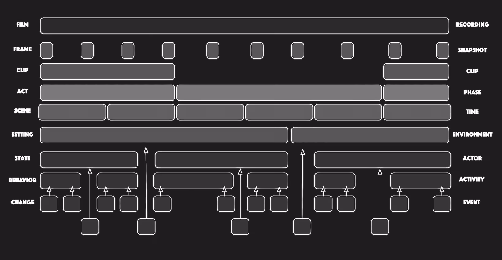
Consider the distinction between a film and a collection of frames. While you can analyze individual frames, measure pixels, and detect motion between adjacent frames, you won’t comprehend the movie. Understanding a movie requires grasping scenes, acts, and narrative arcs—temporal structures that organize the frames into meaningful sequences.
Observability tools give you the frames. They let you scrub back and forth, zoom in and out, compare frames from different cameras. What they don’t give you is the movie. They have no representation of scenes or acts, no concept of dramatic development, no sense of where you are in the story or how it might end.
A temporal architecture would organize observation around these structures. It’d represent episodes as first-class entities, track their development, identify characteristic phases, project likely trajectories. It’d understand that a ‘latency spike’ isn’t a thing but a moment in an episode that has a beginning, a development, and possible endings.
From Observability to Situational Intelligence
The fundamental issue isn’t that current tools are poorly designed. Many of them attempt to apply design principles with varying degress of success with a limited frame. The issue is how the task is conceived.
Observability, as it’s currently practiced, involves instrumenting systems to post measures, collecting those measures, storing them for querying, and providing interfaces for human investigation. While in some cases valuable, it’s not the core of the system itself. The core of the system would be situational intelligence: the ability to know what’s happening, understand its significance, anticipate future events, and determine appropriate actions. This requires not only improved visualizations but also a different underlying model—one that represents situations rather than measures, episodes rather than events, and significance rather than mere data.
Such a model would require visualizations organized around different questions. Not ‘what data are we receiving?’ but ‘what situations are developing?’ Not ‘show me the metrics for this service’ but ‘show me what’s at stake and what’s changing.’ Not ‘let me investigate this alert’ but ‘here’s what’s happening and why it matters.’
The Path Not Taken
It’s worth noting that the industry didn’t have to evolve in this manner. The concepts necessary for situational intelligence—temporal ontology, episode structure, and semantic layers that interpret rather than merely collect data—were already present. These concepts were even articulated in early visions for the potential of observability.
What happened instead was standardization around the data pipe. OpenTelemetry emerged as the organizing force, and it defined a specific ontology: traces, metrics, logs as the three pillars. Vendors optimized for this model. The entire ecosystem converged on ingesting, storing, and correlating these three record types.
This wasn’t wrong, exactly. Standardized telemetry is genuinely useful. But it became the ceiling rather than the floor. Instead of treating data collection as infrastructure for higher-level sense-making, the industry treated it as the end state. ‘Unified observability’ came to mean ‘all three record types in one tool’ rather than ‘genuine understanding of what’s happening.’
The visualizations followed. Once you’ve defined your world as traces, metrics, and logs, your interface will organize around traces, metrics, and logs. The silos aren’t a UI problem; they’re an ontology problem. No amount of design iteration will overcome them without changing what’s underneath.
The Work Ahead
Making complex systems usable (operable) under pressure requires more than better presentation of existing data. It requires different data. It requires systems that model situations, track episodes, represent significance, and surface what matters without being asked.
The visualizations would follow from the model. A situational display emerges naturally when your underlying system represents situations. Progressive disclosure of narrative becomes possible when your system understands narrative. Anticipatory displays become feasible when your system tracks trajectories.
This isn’t a user experience project; it’s an ontological project. The question isn’t how to present metrics, logs, and traces more effectively. Instead, it’s about what we should be representing in the first place—and then how to present that information.
Until that question is addressed, we’ll continue to build data browsers and call them observability. We’ll continue to give operators lab values and expect clinical judgment. We’ll continue to fail the military console test. The tools will remain fundamentally inadequate for the situations they’re meant to serve.
Appendices
Appendix A: Affordance over Analytics
In cybernetics, sensing is only valuable if it informs steering. A feedback loop that measures but can’t affect isn’t a control system; it’s an observation post. The distinction matters because it determines what the system can actually do.
A military console doesn’t just show a missile track; it shows the engagement envelope—the space of possible actions given current position, capabilities, and constraints. The display isn’t merely informational but affordance: it reveals what can be done, not just what’s happening.
Current observability tools are read-only. They show you the fire but not the extinguishers. A dashboard might display database saturation with exquisite granularity—connection pool exhaustion, query latency distribution, lock contention metrics—without ever surfacing the available control levers: shed load, scale read replicas, kill long-running queries, failover to secondary.
This is half a cybernetic loop. The sensing side is sophisticated; the effecting side is absent. The operator must hold the action space in their head, remembering what’s possible, assessing which interventions apply to this situation, navigating to separate systems to execute them. Under pressure, at 3 AM, this cognitive burden becomes failure-inducing.
A true situational display would explicitly map the action space onto the situation. If the situation is ‘cascade failure developing,’ the display would show not just the propagation path but the intervention points: where can the cascade be interrupted? What are the costs and risks of each intervention? Which actions are available given the current authorization and system state? This closes the loop. It moves from ‘what’s happening?’ through ‘what does it mean?’ to ‘what are my options?’ The visualization becomes operational rather than merely informational. It supports action, not just understanding.
The design implication is significant: affordances must be first-class elements of the display, not afterthoughts accessed through separate runbook systems or memorized procedures. The situation and the possible responses to it belong together, because in practice they’re never separate.
Appendix B: From Distributed Blame to Shared Reality
There’s a specific sociotechnical pathology that emerges from silo-structured tools: divergent realities.
When an incident occurs, the database engineer opens the database dashboard. It looks fine— connections are stable, query times are normal, replication lag is minimal. The network engineer opens the network dashboard. Also fine—no packet loss, latency within bounds, no saturation. The application engineer opens the APM. Red everywhere—errors spiking, requests timing out, users affected.
The first twenty minutes of the incident become an epistemological negotiation. Each engineer sees a different reality, and each reality is internally consistent. The database really does look healthy from the database perspective. The network really is performing within parameters from the network perspective. The conflict isn’t about who’s lying but about what counts as the relevant frame.
This isn’t a people problem solvable by better communication or war room discipline. It’s a structural problem created by the tool architecture. When you give different specialists different windows onto the system, you guarantee they’ll see different things. The silos create siloed cognition.
A situational display forces the team to look at the same object: the episode. Not ‘my metrics’ versus ‘your metrics’ but ‘the situation we’re all in.’ The conversation shifts from ‘my dashboard is green’ to ‘we’re in act two of a cascade failure, and here’s where we’re in its development.’
This directly relates to temporal architecture. When everyone agrees on the scene’s boundaries, phase, and trajectory, they can coordinate effectively. However, if they’re viewing individual frames from different cameras, they can’t even agree on the movie they’re watching, let alone predict what should happen next.
Shared reality isn’t a soft benefit; it’s an operational requirement. Incident response is fundamentally a coordination problem, and coordination requires common ground. Tools that fragment reality make coordination harder, not easier, regardless of how much data they provide to each fragment.
Appendix C: The Cognitive Tax
The observability industry has implicitly made an economic decision: to offload the most expensive computational task, synthesis, onto biological hardware.
Synthesis is hard. It requires integrating signals across time, correlating patterns across sources, distinguishing meaningful variation from noise, projecting trajectories from partial data, and assessing significance against operational context. These are computationally intensive operations even for silicon. For a human brain, fatigued, at 3 AM, under pressure, they’re at the edge of what’s possible.
Current tools demand precisely this: they provide the raw materials—metrics, logs, traces—and expect humans to integrate them. The dashboards display data, but the synthesis happens in the operator’s head or not at all.
This isn’t merely bad user experience. It’s a dangerous system design. We’ve built critical infrastructure that depends on human cognitive performance under precisely the conditions that degrade human cognitive performance: fatigue, stress, time pressure, incomplete information. We’re running production systems on the assumption that someone will always be able to think clearly at 3 AM.
The economic framing makes this vivid. Compute is inexpensive and getting cheaper. Human attention is expensive and getting scarcer. Cognitive capacity under stress is the scarcest resource of all. A rational system design would use abundant inexpensive resources to conserve scarce expensive ones. Instead, we’ve built systems that burn human cognition to save backend compute cycles.
The consequences are predictable: burnout, turnover, errors, incidents that escalate because the synthesis didn’t happen in time. These aren’t failures of individual operators; they’re failures of system design that treats human cognition as an unlimited free resource.
A properly designed system would perform synthesis computationally, presenting operators with situations rather than measures, judgments rather than data. The human role would shift from integration to decision—from ‘figure out what’s happening’ to ‘decide what to do about what’s happening.’ This is what humans are actually good at, and it’s sustainable in ways that 3 AM data integration isn’t.
Appendix D: A Lost Decade Doing the Wrong Thing
In 2014, I presented the following prototype images to a team that’d eventually form Instana. After selling out to IBM, they created what I would call Instana 2.0 under the new name of Dash0. And nothing changed. Same old telemetry.